The Psychology of Color in Branded Merchandise: Why Your Swag’s Palette Matters More Than You Think
Your logo is sharp. Your tagline is tight. But the moment someone picks up your branded water bottle or slips on your company tee, color is doing more heavy lifting than any other design element. The psychology of color in branded merchandise isn’t marketing fluff — it’s the reason a navy-blue polo reads “trustworthy” and a hot-pink tote reads “bold, fun, look-at-me.” Choose wrong, and your swag says something you never intended.
Color is the first thing the brain registers. Research from the Institute for Color Research suggests people form a subconscious judgment about a product within 90 seconds, and up to 90 percent of that snap verdict is based on color alone. When you hand out branded merch, you’re not just giving someone a freebie — you’re handing them a palette that tells them what to think about your business.
Let’s break down what colors actually communicate, how to pick them with intention, and where businesses typically get it wrong.
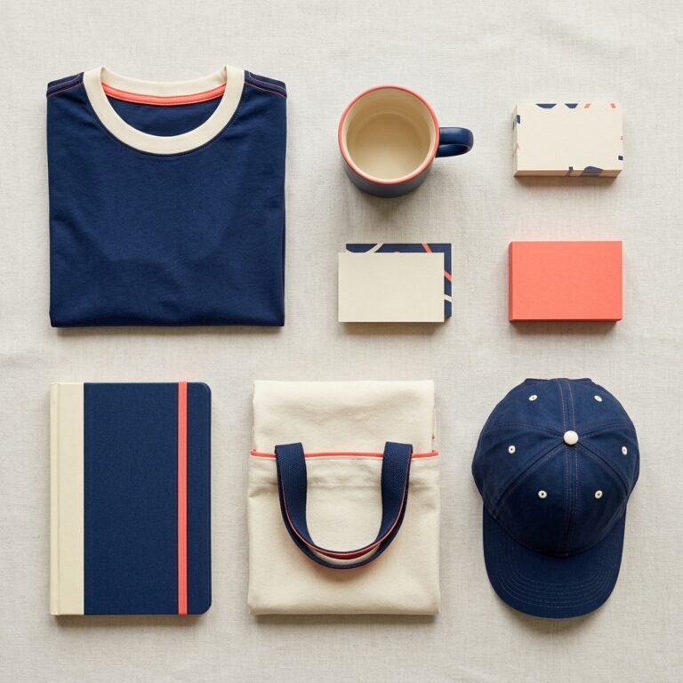
What Each Color Actually Says About Your Brand
Color carries meaning, but context and culture shift it. Here’s a working cheat sheet for the business owner making merch decisions this quarter.
Blue is the overwhelming favorite for a reason. It signals trust, stability, and competence, which is why banks, tech firms, and healthcare companies lean on it hard. If you want customers to feel secure doing business with you, blue pulls its weight.
Red is urgency, passion, and energy. It’s why clearance tags are red and fast-food chains love it. Red grabs attention and drives action, but a full red shirt can read aggressive or loud depending on the shade and audience.
Green signals growth, health, and sustainability. Wellness brands, outdoor companies, and eco-conscious businesses own this space. If your values include environmental responsibility, green puts your money where your mouth is.
Yellow is optimism and warmth — but it’s also the hardest color to pull off. Too bright and it reads cheap; too muted and it disappears. When it works, it’s unforgettable.
Black is premium, sophisticated, timeless. A well-made black tee with a clean logo is almost always a safe bet because it flatters everyone and ages well.
White communicates simplicity and clarity. It pairs with anything and lets your logo breathe, but it stains, wrinkles, and telegraphs every mistake in your print job.
Orange is friendly and energetic without red’s intensity. It reads approachable, which is why it works well for customer-facing teams and community-driven brands.
Purple signals creativity, luxury, or wisdom depending on the shade. Deep purples feel elevated; lavender feels playful.
Match the Color to the Message, Not the Mood
Here’s where businesses slip up: they pick merchandise colors based on what they like, not what their audience needs to feel. A law firm ordering bright coral polos for a client event is sending a mixed signal. A kids’ party rental company handing out charcoal-gray tote bags is leaving energy on the table.
Before you approve a color, ask three questions:
What do we want the recipient to feel? (Calm? Excited? Confident? Curious?)
What’s the setting where this merch will live? (A boardroom conference, a beach festival, a trade show, a gym bag?)
Does this color reinforce our existing brand or fight against it?
If the answer to any of those feels off, you’ve got a color problem — not a product problem.
The Contrast Factor Nobody Talks About
Even the right color fails if it can’t be seen. A navy logo on a black hoodie might feel sleek to you, but across a crowded event floor, no one can read it. Branded merch is essentially a walking billboard, and billboards only work when they’re legible.
High contrast between your logo and the garment — light on dark, or dark on light — makes your brand visible from across the room. That’s free marketing every time someone wears your tee to the grocery store. Tone-on-tone prints have their place (elegance, subtlety, luxury lines), but they sacrifice reach for refinement.
If your primary goal is brand awareness, prioritize visibility. If your goal is exclusivity or a high-end feel, tone-on-tone can be the smarter call.
Cultural and Industry Context Changes Everything
Color meaning isn’t universal. Red is celebratory and lucky in many East Asian cultures but signals danger in Western safety contexts. White is bridal in the U.S. and funereal in parts of Asia. If you’re marketing across regions, do the homework before you commit to a palette.
Industry context matters too. A tech startup can get away with electric lime green in a way a wealth management firm never could. A yoga studio can embrace dusty pinks and sage that would look bizarre on a construction company’s hi-vis vests. The more your color choices align with industry expectations — or break them with clear intent — the stronger your brand signal.
When to Break the Rules (and Stand Out)
Sometimes the smartest play is to zag. If every competitor in your space leans blue, a bold ownable color can make you instantly recognizable. Think Tiffany’s robin’s-egg blue, John Deere’s green-and-yellow combo, or T-Mobile’s magenta. Those brands didn’t pick safe — they picked distinctive, then committed hard enough that the color became the brand.
Breaking the rules works when the choice is intentional, consistent, and backed by a visual identity that holds up. It fails when it’s just personal preference dressed up as strategy.
Get the Color Right, and the Merch Does the Work
The right color on the right product turns a forgotten giveaway into a piece someone actually wears, carries, or keeps on their desk. It’s the difference between swag that lives in a drawer and swag that becomes a quiet ambassador for your brand.
If you’re not sure what your merch is really saying — or you want a partner who thinks about color as hard as you think about your logo — we can help. At Amplified Ink, we work with businesses to build branded merchandise that looks intentional, prints cleanly, and actually gets used.
Ready to make your next print run pull its weight? Talk to us at amplifiedink.co and let’s build merch that sounds like your brand the moment someone picks it up.