How to Read a Proof Before You Approve It: A Five-Minute Check That Saves Your Merch Order
Every custom order we run hits the same checkpoint before a single shirt gets printed or a single card hits the press: the proof. It lands in your inbox, it looks close enough, and it is tempting to fire back “Looks great!” in ten seconds. That quick yes is where most merch mistakes are born.
Learning how to read a proof is the cheapest insurance your brand will ever buy. It takes five minutes, and it protects hundreds or thousands of dollars in product. With Q4 orders stacking up and holiday deadlines getting tight, a reprint is the last thing anyone has time for. Here is exactly what we look for when we review a proof, so you can look for it too.
What a Proof Actually Is (and What It Is Not)
A proof is a visual contract. It shows your artwork placed on the actual product, at the actual size, in the actual position, with the ink colors and decoration method spelled out. When you approve it, you are telling the production team: build exactly this.
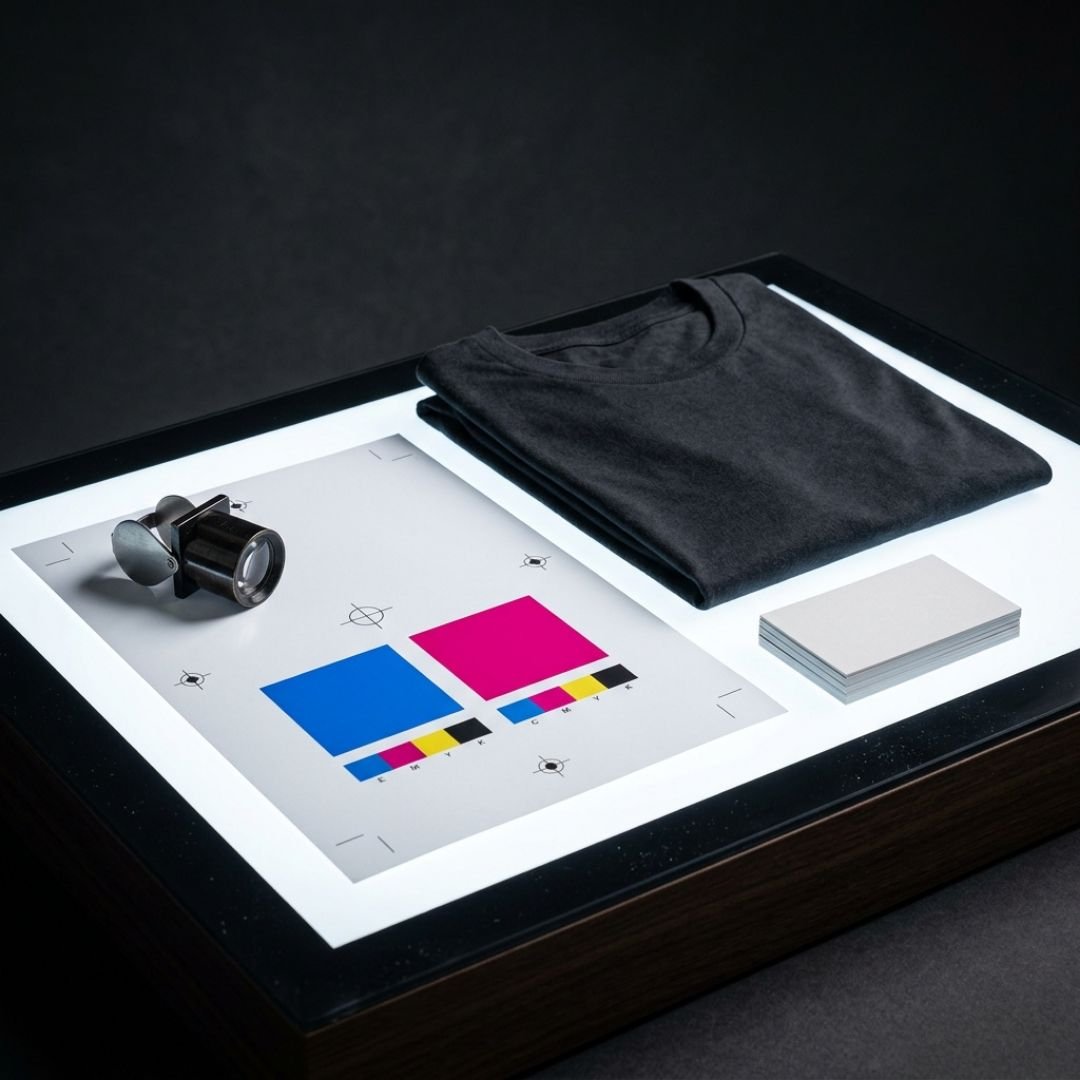
What a proof is not is a perfect preview of real-world color. Your screen is backlit and every monitor is calibrated a little differently. A digital proof shows placement, size, spelling, and color callouts. It does not show how magenta ink sits on a heather gray tee under fluorescent office lights.
The Five-Point Proof Check
Run through these every time, in this order. Slow down on each one.
1. Spelling and details. Read every word out loud. Names, phone numbers, URLs, dates, and taglines are the usual suspects. Then have someone who did not write the copy read it too.
2. Size and placement. Check the listed dimensions, not just the mockup. A left chest logo is usually around 3.5 to 4 inches wide. A full front print might run 10 to 12 inches. If the proof says 2.5 inches and you pictured something bold, speak up now.
3. Color callouts. Look for the specific ink or thread colors listed on the proof, often as PMS (Pantone) numbers. Confirm they match your brand standards. If your brand blue is PMS 2728 and the proof says 286, that is a real difference once it is on fabric.
4. Product details. Garment style, color, size breakdown, quantities, and imprint locations should all match what you ordered. It is easy to focus on the logo and miss that the proof shows navy when you asked for charcoal.
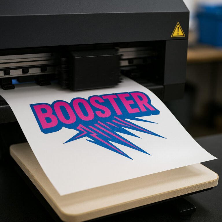
5. Decoration method. Screen print, embroidery, DTF, laser engraving, and full-color digital each have strengths and limits. Make sure the method on the proof is the one you expected, and that fine details in your artwork will survive it. Tiny text rarely holds up in embroidery, for example.
Where Proofs Usually Go Wrong
After years of running orders, we see the same handful of misses come up again and again:
- Approving on a phone. A 6 inch screen hides small typos and makes everything look proportionally fine. Open proofs on a laptop or desktop and zoom in.
- Approving by committee, then changing by committee. Decide up front who has final sign off. Three people approving in three separate emails is how contradictory changes sneak in.
- Assuming the printer caught it. A good shop flags obvious problems, but nobody knows your business details like you do.
- Skipping the fine print. Proofs often include notes about artwork adjustments, like thickening thin lines for embroidery or converting a gradient for screen printing. Read those notes. They explain why the proof might look slightly different from your original file.
When to Ask for a Physical Sample
For most repeat orders, a digital proof is plenty. But some situations deserve a physical pre-production sample:
- A brand new logo or brand color you have never printed before
- Large runs where a mistake would be expensive
- Tone-on-tone designs, metallic inks, or specialty finishes that screens cannot show accurately
- Products going into a retail setting, where the finished piece has to be flawless
A sample adds time and sometimes a small cost. On a 500 piece order headed to a trade show, it is money well spent. Just build it into your timeline, especially this time of year.
Approve With Confidence
The best proof approvals are specific. Instead of “Looks good,” try “Approved as shown. Left chest logo at 3.5 inches, PMS 2728 thread, charcoal polos, quantities as listed.” It confirms you checked and gives everyone a clear record.
If something feels off and you cannot put your finger on it, ask. That is what the proof stage is for. Revisions at the proof stage cost nothing but a few minutes. Revisions after production cost a full reprint and a missed deadline.
Let’s Get It Right the First Time
At Amplified Ink, every order gets a clear, detailed proof and a real human who will walk you through it. We would much rather answer ten questions before the press runs than fix one problem after. If you are planning year-end gifts, Q1 uniforms, or early 2027 event merch, now is the time to start.
Ready to start your next project with a proof you can trust? Get in touch with Amplified Ink and let’s build something your brand will be proud of.