How to Choose the Right Print Finish for Your Business Cards
Your business card has about three seconds to make an impression. That’s the time between a handshake and a pocket. What happens in those three seconds — the weight of the card, how it catches the light, whether someone’s thumb lingers on the surface — is almost entirely controlled by one decision most business owners never think about: the print finish.
Choosing the right print finish for your business cards isn’t a detail. It’s the difference between a card that gets tossed into a drawer and one that sits on someone’s desk for six months. Here’s how to pick the finish that actually fits your brand.
Why Print Finish Matters More Than You Think
A business card is a tiny piece of marketing real estate, but it’s physical. That’s rare now. Most of your brand lives on a screen — social posts, email signatures, landing pages. A card is one of the few times a prospect holds your brand in their hand. The finish is the first thing they feel.
Finish affects perception in three ways. It signals price point (matte reads premium, gloss reads commercial). It shapes durability (some finishes fingerprint, some scratch, some hold up for years). And it influences usability (can someone actually write on it with a pen when they jot a note on the back?).
Treat the finish decision like you’d treat choosing fabric for a uniform. The right call depends on who’s wearing it, where, and why.
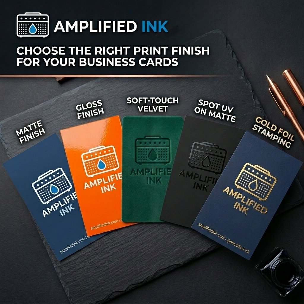
Matte Finish: The Confident Minimalist
Matte is having a moment, and for good reason. It absorbs light instead of reflecting it, which gives the card a soft, understated look. Colors appear slightly muted, which actually makes matte a strong choice for brands with sophisticated palettes — deep blues, charcoal, warm neutrals, earthy tones.
Matte finishes also photograph beautifully. If your cards end up in social content, unboxing videos, or press kits, matte is your friend. No glare, no awkward hotspots.
The tradeoffs: matte cards can show fingerprints more than you’d expect, especially in darker colors. They’re also slightly more prone to scuffing on edges. For a designer, consultant, architect, or any service brand where a refined feel beats visual pop, matte is usually the right answer.
Gloss Finish: The Loud, Proud Workhorse
Gloss is the classic business card finish — shiny, reflective, and punchy. It makes colors look saturated and vivid, which is why gloss works so well for brands with bold, bright palettes. Think restaurants, retail, fitness studios, event companies, anything built around energy.
Gloss is also the most durable of the common finishes. It resists smudging, handles humidity well (hello, Florida), and looks crisp months after printing. If your cards get passed around a lot — trade shows, conferences, retail counters — gloss earns its keep.
The tradeoff is you can’t write on a gloss card without a permanent marker. If your sales process involves people jotting notes on the back, skip gloss.
Soft-Touch (Velvet) Finish: The Premium Pick
Soft-touch is what people mean when they say a card feels expensive. It has a velvety, almost suede-like texture that makes the card feel thicker than it is. Hand someone a soft-touch card and watch their thumb linger on it — that’s the finish doing its job.
This is the finish for brands where perception of quality is load-bearing: law firms, luxury brands, high-end real estate, creative agencies, specialty consultants. It costs more than gloss or matte, but the return on that few extra cents per card shows up in how your brand gets remembered.
One note: soft-touch is best paired with heavier card stock (16pt or higher). Put it on thin stock and you lose the whole effect.
Spot UV and Foil: When You Want the Card to Do Work
Spot UV applies a glossy, raised coating to specific areas of your card — usually the logo, a tagline, or a design element. On a matte or soft-touch base, spot UV creates dramatic contrast. Your logo practically glows.
Foil stamping presses metallic or colored foil into the card itself. Gold, silver, rose gold, copper, or custom colors. It’s the finish that makes people say “oh, wow” out loud.
Both are premium upgrades, and both work best when used with restraint. A spot UV logo on a matte card is stunning. Spot UV on every element on a gloss card is a mess. Pick one hero element and let it carry the weight.
How to Make the Call
Start with the brand, not the finish. If your brand is quiet, refined, and detail-obsessed, lean matte or soft-touch. If it’s loud, energetic, and bright, gloss will serve you. If you want the card itself to communicate that you invest in quality, soft-touch with a foil accent is your move.
Then factor in use case. Trade show cards take a beating — go gloss or soft-touch. Cards that get written on need an uncoated or matte surface. Cards meant to sit on a desk should feel substantial in the hand.
And get samples. Any print shop worth working with will show you finishes side by side before you commit. Hold them. Pass them around. The right one will make itself obvious.
Ready to Print Cards That Actually Get Kept?
At Amplified Ink, we help businesses pick the finish, stock, and design that match the brand — not just what looks good on a proof. If you’re due for new cards or launching a brand, let’s make sure they’re cards people don’t want to throw away.