Custom Signage That Sells: Banners, Feather Flags, and Display Kits That Actually Stop People
Your booth looks great from six feet away. The problem is that nobody is standing six feet away — they’re walking past at eleven feet, scanning for a reason to stop, and your sign is a beige rectangle with your logo shrunk to the size of a business card.
Custom signage is the most under-thought purchase in small business marketing. Businesses will agonize over a t-shirt color for two weeks, then order a banner in an afternoon because “it’s just a banner.” But signage is often the very first brand impression a person gets — at a festival, in a lobby, outside a storefront, behind a folding table at a chamber mixer. It sets the tone before a single word is spoken.
Here’s how to choose the right custom signage for your business, and how to make sure it actually pulls people in.
Start With Distance, Not Design
Before you think about layout, decide how far away your reader will be. That one number drives everything else.
At 3 to 5 feet — a table sign, a counter card, a menu board — you can use real sentences, prices, and detail. People are already stopped.
At 10 to 20 feet — a retractable banner beside your booth, a lobby sign, a window graphic — you get roughly six words. One headline, your logo, and a way to find you. That’s it.
At 50 feet and beyond — feather flags, building banners, roadside signage — you get a shape and a color. Not a sentence. Your logo needs to be legible as a silhouette, and your brand color needs to do the identifying work.
Most bad signage fails because it was designed on a laptop screen at 100% zoom, where everything is readable. Shrink your design to thumbnail size on your phone. If you can’t tell what it says, neither can the person walking by.
Match the Format to the Job
Different signage does different work, and the popular option isn’t always the right one.
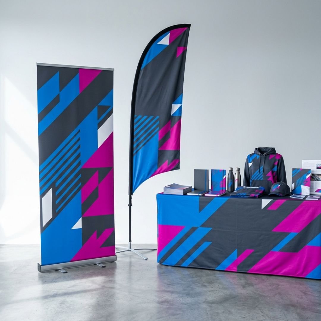
Retractable banner stands are the workhorse. They set up in thirty seconds, store in a carrying case, and travel to every event you’ll attend this year. If you buy one piece of signage, buy this. Spend a little more for a wide, heavy base — the cheap ones tip over in a breeze and look flimsy on camera.
Feather flags win outdoors. They move, and movement catches the eye in a way that a flat panel never will. They’re the right call for sidewalk visibility, parking lot events, and any crowded field of booths where you need vertical height above the crowd.
Table throws and runners are the most overlooked upgrade in the lineup. A branded table cover instantly turns a rented folding table into a professional display, hides your boxes and power strips underneath, and photographs beautifully. Dollar for dollar, it’s the biggest visual jump you can make.
Rigid signs and A-frames are for permanence — storefronts, directional wayfinding, “we’re open” messaging. Coroplast is cheap and short-term; aluminum composite lasts for years outdoors.
Window and wall graphics turn square footage you’re already paying for into free advertising. Vinyl on glass is one of the highest-ROI branded materials a brick-and-mortar business can order.
Design for One Job Per Sign
The most common mistake we see isn’t ugly design — it’s crowded design. A single banner gets asked to carry the logo, the tagline, five services, three certifications, a QR code, a phone number, a website, and every social handle.
Pick one job per sign. A booth banner’s job is to say who you are and what you do. A table sign’s job is to explain your offer. An A-frame’s job is to get someone through the door. When each piece has one assignment, the whole setup reads clean and confident instead of anxious.
Leave white space. Empty space isn’t wasted money — it’s what makes the important thing look important.
Build a Kit, Not a One-Off
The businesses that look sharpest at events aren’t the ones with the biggest budget. They’re the ones whose pieces match.
A signage kit means your banner, table throw, flag, and handouts all use the same colors, the same fonts, and the same logo lockup. Order them together, from the same shop, and the color matching is handled for you. Order them piecemeal across three vendors over two years, and you end up with three slightly different blues sitting next to each other — which reads as sloppy even to people who can’t articulate why.
Build the kit once. Reuse it for years. Refresh individual pieces as messaging changes.
Check the Boring Stuff Before You Print
A few details that quietly ruin otherwise good signage: submit vector artwork, not a logo pulled off your own website. Confirm the finished dimensions against the space you’re actually filling — measure your booth, your window, your wall. Ask about grommets, pole pockets, and hemming for anything going outdoors. And proofread the phone number out loud, twice. Print is unforgiving.
Ready to Show Up Sharper?
Great signage doesn’t just decorate your space — it earns attention before you say a word. Whether you need a single banner for next month’s expo or a full kit that makes your business look twice its size, Amplified Ink handles the design and the print so every piece matches.
Let’s build signage that stops people. Get started at amplifiedink.co.